Categories ➤ Icon Watch

Three Months, Three Icons

Posted in Icon Watch

Since its initial launch last May, iA Writer for Mac was subject to two significant icon updates already, totaling three distinct iterations in less than three months.
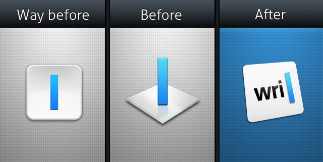
iA Writer Icons

No one would argue that the original icon was an out-and-out faux pas; not only it looked like an unpolished iOS port, but it failed in providing any easily identifiable cues relevant to the application’s main function, i.e. distraction-free writing.

The second icon gained significantly in polish, but still lacked in symbolism and affordance. Worse still, the 3D effect made the blue cursor look even more abstract and irrelevant.

Last week, iA introduced yet another icon featuring a HIG-compliant 2D perspective and an instantly recognizable typing cursor. Most remarkably, this third — and hopefully last — iteration comes with an interesting twist: each distinct icon size represents a step in typing the word “writer”.
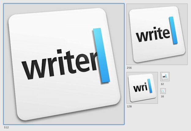
Different Sizes of iA Writer Icon

A clever idea that addresses brilliantly the shortcomings of the two previous solutions. Oliver Reichenstein explains in a Google+ :

Figuring out how we can do both 3D and 2D […] and match all needs across platforms, different sizes and environments (app store, springboard, finder, dock), with the same logo is what took us so long.

Good designers strive to get it right from day one, great designers iterate.

The Facetime Icon and the HIG

Posted in Icon Watch

Facetime Mac Icon
The Facetime for Mac icon.

I was hoping Apple would realize how unfit and *gasp* ugly the FaceTime icon is. Alas, the app is out of beta and that just didn't happen. The Cupertino company that we all love is giving us one more reason to worry about the recent directions of its UI design.

The icon is horribly lacking the polish Apple got us used to.

First of, the main part of the icon is coming straight from iOS and is by no mean suitable for a desktop application.

Facetime iOS
A clearly distinguishable Facetime iOS icon to the left.

While perspectives and materials have their own sub-section in Apple's OSX Human Interface Guidelines, none of them seems to apply to this icon. To quote Apple:

Generally, Mac OS X user application icons are designed to appear as if they’re sitting on a desk in front of you.

FaceTime Perspectives
The FaceTime icon and the recommended HIG perspectives.

Second, the shape to the right looks awful and the lousy highlights / shadows won't make it look any less alien.

Facetime Fail
The alien right shape of the Facetime icon.

However, the real issue with this icon goes beyond the HIG and pure aesthetics.

It is visual dissonance.

The container speaks minimalism and symbolism, while the content speaks realism and high fidelity. Those are two antipodal visual languages, and the way our brains interpret them is significantly different.

Facetime Icon Components
Facetime icon components.

Symbols represent a whole; a generic, rough representation of things. We interpret them by adding in necessary details as the image forms inside our brains. Meanwhile, high fidelity representations, especially when they are of a single part from a whole, get interpreted through extrapolation: the brain brings in the other missing parts to form the big picture, the whole.

Back to the FaceTime icon, our brains have to process both languages simultaneously, and that's exactly why it may look 'weird' to you at first glance. Also, to make matters worse, the two elements depict exactly the same thing: a camcorder / webcam.

Trying to be too many things at the same time is probably a bad idea. Keep it classy, Apple.

Recent App Icon Redesigns

Posted in Icon Watch

I care about icons. I really do. Many third party developers care about icons as well. The latter explains why they go as far as designing new icons from scratch for every major update, while the former explains why I would go as far as writing about it.

iDocument

iDocument
iDocument icon: before & after.

iDocument is my favorite document manager for Mac. It borrows heavily from iPhoto and would have been easily mistaken for an Apple application. As for the recent icon redesign, it's neither an improvement nor a misstep, even though I personally prefer the original. The new icon features more vivid colors and few additional grams of gloss, making it look less professional and cutting-edge.

iStat Menus

iStat Menus
iStat Menus icon: before & after.

The icon of our favorite system monitor has also undergone a plastic surgery in the most recent update. The top highlight is a welcome addition as it gives a subtle 3D look to a previously flat and boring icon. The new bezel emphasizes this effect thanks to its smoother and more rounded surface.

Snowtape

Snowtape
Snowtape icon: before & after.

And then there is Snowtape, the best radio application for mac. Bar none. The new icon of Snowtape 2 parted with the marker which contributed considerably in emphasizing the DYI feel that made the old icon look original and playful. While gaining in refinement and glitz, the new icon is uninteresting and monotonous at best.

Thoughts on the New iTunes Icon

Posted in Icon Watch

iTunes 10 Icon
iTunes 10 icon.

Yesterday Steve unveiled the new iPod lineup, a completely revamped Apple TV and unsurprisingly a new iTunes with social networking capabilities and a brand new icon.

Like many of you, I am not convinced that Apple is going the right direction with this redesign. Of course, it would be silly to argue that the new icon is horrible, because frankly, it is not (Windows icons anyone?). I won't go as far as looking into the stylistic details neither; why keep the same old musical note for an application that can manage e-books and movies goes way beyond my grasp. But that's not my point: It's the departure from Apple's own HIG (Human Interface Guidelines) for OSX that shocked me the most.

You don't need to be a designer to notice that the icon is standing out among other Apple applications (iChat is an exception that confirms the rule). Where is the realism Apple got us used to? Where is perspective? Details? And If they decided to drop the CD in the iTunes icon, then why would they keep the ink for Pages and the compass for Safari? Could it be the new direction Apple will be taking for all its future icon redesigns? Hope not.

Bottom line, unless Apple redesigns all its default OSX icons, or resurrects the old icon in a 10.0.1 update, I think their interface design consistency could be seriously put into question.