Posted in Insights

Your mileage may vary, but I think Google+ has what it takes to compete against the blue juggernaut. Smart interactions and streamlined privacy controls drastically improve user experience on a social interface and Google seems to be pouring considerable resources in this direction.

Notwithstanding, the iOS client of Google+ is blatantly falling short of the standards set by the web interface. Given the fact that Facebook have just rolled out a decent update to their iOS app, Google is clearly losing the edge on the mobile front. They may have the best talent in the industry, but for some reason they don’t seem to be giving the iPhone app the attention it deserves. It’s a mishmash of web views, experimental touch interactions and unpolished graphics, resulting in a subpar user experience and jeopardizing the Google+ brand image along the way.

Signing In

As of this writing, users have to go through two completely useless screens (2 taps) to get to the sign in form. In order to create an account, you have to hunt down a blue underlined link in the second screen, hello 1990. Worse still, the form is an ugly web view that screams laziness and utter disregard to interface design principles.

The obvious solution would be greeting users with the actual sign-in form as shown in the interface mockup below.

I attempted to stay as close as possible to the colorful visual style that Google has been pushing as of late, which is if you ask me, a step in the right direction.

The Stream

I always thought that dashboard navigation on mobile apps is as hacky a design pattern as it can get. If you have more than five main sections in your app, you are doing it wrong. If you have five or less but you insist on using a dashboard, you are doing it twice as wrong.

It would safe to assume that users will be spending most of their time on the stream, so why not make it the default tab as in the web interface? Ironically, designers (or someone else at Google) decided to keep the Homeish icon even though it was no longer the default view in the iOS app. Attention to details anyone?

The mockup below shows how a native tab navigation could save users a few taps and leverage their previous experience with the platform.

Notifications would appear next to the logo in the top navigation bar, making them hard to miss throughout the different sections of the app. Content should be given more prominence by using the full-width of the screen. Ideally, raw URLs should be hidden as long as the actual content of the link is displayed inline.

Touch Interactions

I know, buttons are a hack yada yada, but I’d argue that users won’t be switching streams often enough to warrant a full-fledged gesture navigation system. Touch gestures should be primarily used to perform frequent single-post actions, something along the lines of swipe to +1 as shown in the concept (left) below. A popover would come to the rescue as a perfectly scalable design pattern to handle context switching (see mockup below). Other single post actions such as commenting and sharing would be revealed with a single tap in order to reduce visual clutter (a pattern used brilliantly by Tweetbot).

While these experimental concepts are in no way a panacea for the current interface shortcomings, they could be a very good start if Google decides to get more serious about its fledgling social network.

Invisible Interfaces

Posted in Insights

Siri

Amidst all the excitement around Siri, I came across an interesting article [1] from the 90s, where Mark Weiser, ex-principal scientist at Xerox PARC, voices his skepticism about voice input and intelligent agents. The central premise of his argument is that interfaces are first and foremost tools, and as such, should be invisible.

Eyeglasses are a good tool — you look at the world, not the eyeglasses. […] Unfortunately, our common metaphors for computer interactions lead us away from the invisible tool, and towards making the tool the center of attention.

He goes on to explain that voice-based digital assistants, as portrayed in science fiction back then, are prominent and attention-grabbing, which makes them inherently bad tools:

A computer that I must talk to, give commands to, or have a relationship with, is a computer that is too much the center of attention.

To an extent, he makes a valid point; good interfaces should not vie for user attention. But then, the computer he imagined talking to is certainly not one you can fit in your pocket. In that sense, we are by all means moving one step closer towards invisibility.

  1. The article appeared in the first issue of Interactions Magazine (January 1994)

Text Editors: A Rant

Posted in Kaishinlab

Back in the early 2000’s, I designed crappy websites using clunky tools from Macromedia and Adobe. As I switched to Mac in 2006, I had the chance to give Textmate a try and was thrilled with its chromeless interface and advanced syntax highlighting. I gradually moved away from WYSIWYG tools, and before too long, I was already enjoying every line of code I write in Textmate.

Now don’t get me wrong, I am a designer, not a programmer. While I do happen to tinker occasionally with PHP, Python or Ruby, most of the code I write is HTML markup or pre-processed CSS. This leads me to another point: interface is a deciding factor when choosing my tools of the trade.

Ignorance is bliss. –Thomas Gray

Textmate was my ideal GUI text editor, until I had a closer look at the competition, that is. I have become to realize that there has been little to no improvement made to Textmate in the recent years. No auto-save, dumb undo, no dropdown autocomplete, not even a fullscreen mode. Sure, some of these features can be enabled via bundles and hacks, but I have a preference for native, officially-supported solutions.

And thus began my hunt for an alternative.

At first, I tried Coda and Espresso for a reasonable amount of time. Unsurprisingly, I was quite impressed with their endeavor to make web design and development as seamless an experience as possible. Notwithstanding, their main selling point is also their biggest snag: they suck as standalone text editors, and come to think of it, they never pretended to be one.

Subsequently, I turned to Google for enlightenment. The first results hinted at BBedit, Vim and Emacs. Albeit being the darlings of many, Vim and Emacs are simply too keyboard-centric for a mouse-trained brain like mine, not to mention their daunting learning curve and ugly non-native interfaces.

Eventually, my next stop was the two-decades-old BBedit, which coincided with the release of a major Lion-compliant update. Recommended by many pundits, I was almost confident that BBedit would put an end to my quest. Alas, that didn’t happen as I was offended by the intrusive toolbar, the nebulous syntax highlighting and the poor support for popular CSS preprocessors.

Although I was initially reluctant to try less popular alternatives, I had little choice but to wade through an unhealthy number of Textmate–2-wannabes. Some are clearly coming out of the lot (Sublime Text), while many are too unstable for doing any serious work. What they all seem to have in common though is the lack of support and third party extensions.

End of the road? I am concurrently using Sublime Text 2, BBedit and Espresso 2. Am I satisfied with my current workflow? Hell no, and not even the recent Textmate 2 announcement was enough to placate my urgent craving for a decent text editor.

Icon Template

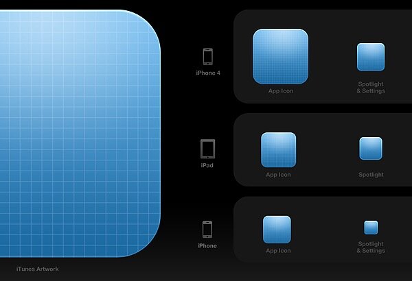
A nice update to Michael Flarup’s icon template. Comes as a PSD with live multi-size previews, export actions and an awesome set of default textures.

iOS